INTERVARSITY
2021
InterVarsity Chapter Finder Redesign
Find a Chapter is a highly functional website using a database of existing InterVarsity chapters on college campuses across the United States — used by college students, parents, donors, administrative staff, and alumni.

CLIENT
Xemelgo Software
YEAR
Jan 2025
TIMELINE
3 Months
PROJECT OVERVIEW
Find a Chapter is a highly functional website that uses a database of existing InterVarsity chapters on college campuses across the United States — used by college students, parents, InterVarsity donors, administrative staff, and alumni.
My Scope:
User Research, UX Design, Branding, Database, Data Analytics, CMS
Tools:
Figma, Miro, HotJar, Google Analytics, Xtensio, Salesforce, Drupal 9 CMS
Duration:
1 Month — July 2021 to August 2021
Client:
InterVarsity
My Role:
UX Design Intern
Team:
Ashley Crutcher — UX Manager
William Cheung — UX Designer
Steven Yeo — UX Designer
Mark Breneman — Director of Digital Services
Gary Nauman — Senior Graphic Designer
Mary Massey — Developer
Ashlye Vanderworp — Editorial Manager
The Problem
The Problem
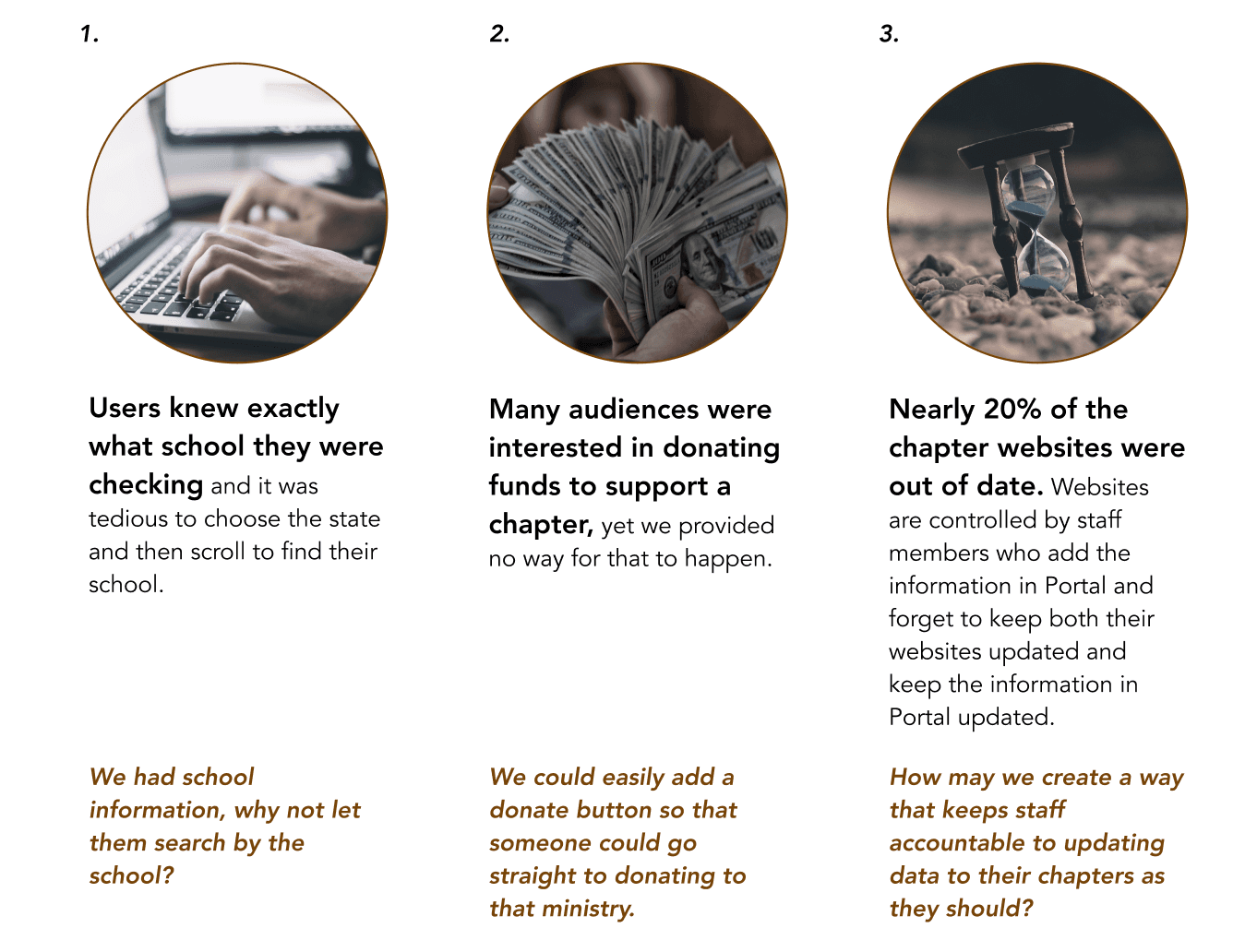
During user research in 2016, the main insight found was that users often knew exactly what school they were checking — it was tedious to choose the state and then scroll to find their school. We had school information, so why not let them search by school?
The Goals
Salesforce data: Displayed content can only draw from what is currently in the database.

Design Approach

User Research
Stakeholder Interviews × 5 people
I wanted to understand more of the KPIs and OKRs that determined the success of the website and for the users.

User Interviews × 5 people
Insights:
72% said websites without photos did not motivate them to attend. 86% said hearing other people’s stories and impact boosted their motivation to participate.
The current website has no expression of impact or photos of the chapters.
“If joining that community adds purpose in my life. If I don\’t see people happy there, why would I want to join?”
“It seems like a legit organization, and it shows through photos that a lot of people go.”
Secondary Research Insights
Revisiting previous user research done in 2016, I found key insights that informed the redesign direction.
Hosting UX Audit Activity
With all the information collected from stakeholder interviews, user interviews, and secondary research, I looked at the current website and realized it doesn\’t allow users to donate to a chapter, start a chapter, and it lacks a lot of vision/impact. To confirm my hypothesis, I hosted a UX audit workshop for the team to discover themes.


Affinity Mapping — Themes
It can be confusing when there are 3 different CTAs to do one action
There is a video that describes the importance of InterVarsity chapters — that is a praise
There is no current way for users to learn how to start a chapter
Personas
I wanted to figure out the questions that each different type of user would ask, and make sure those questions were answered in my design.

Wireframing for Layout


The Proposed Landing Page
The Proposed Landing Page
BEFORE — 2019 Design

White space on both sides, photo banner does not motivate user
Outdated look from the previous version of Drupal CMS
No additional information about starting or working at a chapter
AFTER — 2021 My Design

Full-width banner with one search bar CTA; radio buttons for state/zip search method
Real student testimonies on what it feels like to be at a chapter
Additional information about starting or working at a chapter
Specific Features
Specific Features
Updated Default Search CTA
After
Replaced “Near Me” with “Zip Code” — research showed people never used “Near Me”
Default radio button is “search by school” — users know exactly what school they’re searching
Before
3 confusing CTAs for the user
Outdated with the old Drupal 7 content management system
Newly Added Testimonies Section
Based on research, a student’s main motivation to join a college InterVarsity chapter was based on the testimonies they heard from other students.

Slant Style Usage from Brand
Additional slant block style at the top and bottom to emphasize content inside (CTAs).

Updated Error Message
Before

After

Additional Helpful CTA + Updated Pagination
CTA — After
Based on research, chapters were short-staffed
All resources for chapters in one single place
Pagination — After
Page numbers implemented — shorter pages with lower loading latency
Footer is more visible; previously the user scrolled forever with no page numbers
